I've been trying to snap at least one Instagram a day, and just this afternoon a project idea for them came into my mind. You know how Instagram has all those lovely filters to choose from? The kind that make every poor man's latte look like some artisan gourmet thing from France? The kind that inject 500 Days of Summer-y vibes into your photos of that unassumingly grungy skyscraper? The kind that turn shoegazing into some kind of modern art? Oh yeah, you know.
Well, I've always been curious to know exactly how Instagram's filters work -- what exactly they're coded to lighten and darken, fade and flare? How do I reproduce these effects in the rest of my photography? I decided I would take these recent shots, apply a desirable Insta-filter to them, then see how close I could get to recreating that filter on iPhoto's humble editing software. Not a bad way to learn the art of photo enhancement, eh? Eh? Humor me.
So, to make up for 1 week of no posting, here are 7 photos, 7 filters, and 7 breakdowns by me:
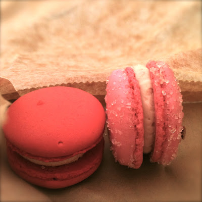
1) Two Macaroons (Elephant Delicatessen - Portland, OR)
 | |
| Original |
 |
 |
| Self-Edit |
Instagram Filter Solution: Amaro
Recreation Recipe: Square crop, increase exposure to 1.23, bring contrast down -4, take saturation to 39%, increase highlights 15%, de-noise 14%, bring the temperature -4 colder, tint 3 toward green, Edge Blur Effect +3.
2) Looking Up (9th & Pike St. - Seattle, WA)
 |
| Original |
 |
 |
| Self-Edit |
Instagram Filter Solution: Hefe
Recreation Recipe: Amp contrast about 85%, saturate 57%, Color Boost +2.
3) Le Maison d'Oiaseaux (Anthropologie Window - Portland, OR)
 |
| Original |
 |
 |
| Self-Edit |
Instagram Filter Solution: Lo-Fi
Recreation Recipe: Increase exposure 0.68, boost contrast to 100%, saturate 57%, increase sharpness to 9, Color Boost +1, Color Fade +1.
4) Skyway (somewhere on Wall St. - Seattle, WA)
 |
| Origianl |
 | |
 |
| Self-Edit |
Instagram Filter Solution: Inkwell
Recreation Recipe: Turn on Black & White, Increase exposure to 0.78, boost contrast to 100%, bring upper level control to 94% and mid level control down about a quarter.
5) Say Cheese (University District - Seattle, WA)
 |
| Original |
 |
 |
| Self-Edit |
Instagram Filter Solution: Valencia
Recreation Recipe: Increase saturation 69%, Decrease shadows to 36, bring temperature toward blue -20, bring tint toward red -25, bring lower level control up to 9%, Antique Effect +1.
6) Diamond in the Sky (Paramount Theater - Seattle, WA)
 |
| Original |
 | |
 |
| Self-Edit |
Instagram Filter Solution: Sutro
Recreation Recipe: Increase exposure to 0.9, increase contrast to 30, increase highlights to 19 and shadows to 8, bring temp toward blue -48, bring tint toward red -42, bring lower level control up to 5%, Antique Effect +1.
7) Roseshadow (My Bedside Table)
 |
| Original |
 |
 |
| Self-Edit |
Instagram Filter Solution: Sierra
Recreation Recipe: Increase exposure to 0.36, decrease saturation to 33, increase definition to 12, increase highlights to 5 and shadows to 15, edge temp toward yellow +1, bring tint toward red -4, bring mid level control a fifth of the way down.
Whew! I'm really pleased with how most of these turned out, but it's clear where Instagram has the upper hand on my cruddy editing program: COLOR. Compare the Insta Cheeto to the latter one. Also the chandelier pic that I couldn't quite get purple enough, no matter how much I messed around with tint and temperature. It may be that I just lack basic color-creation knowledge, but considering I've been obsessed with palettes for the past 5 years, I would find that surprising.
How do you colorize your photos? Do you have any tips or tricks for me? Please leave them below!
More soon,
-R


Everything is very beautiful. Clearance at the highest level. Photos can be done in different social networks. Recently did a photo album and use return here this website macphun.com/filters-for-photos . It was awesome. I think to make some photos for your instagrama through your application.
ReplyDelete